-
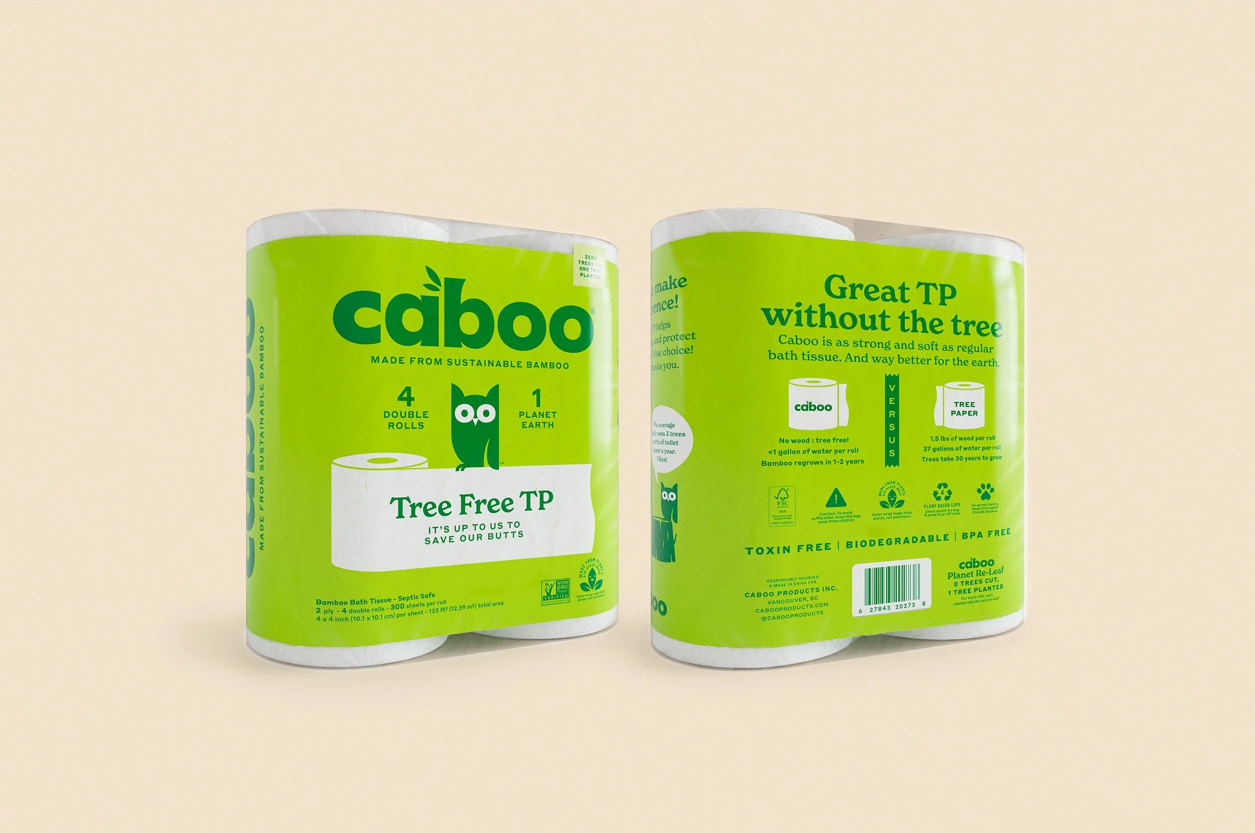
Caboo, a pioneer in the bamboo paper products category, was getting crowded out by new competitors. Its important (and impactful!) environmental message was getting lost in a slurry of statistics. The brand was bland, emotionless, and losing ground.
-
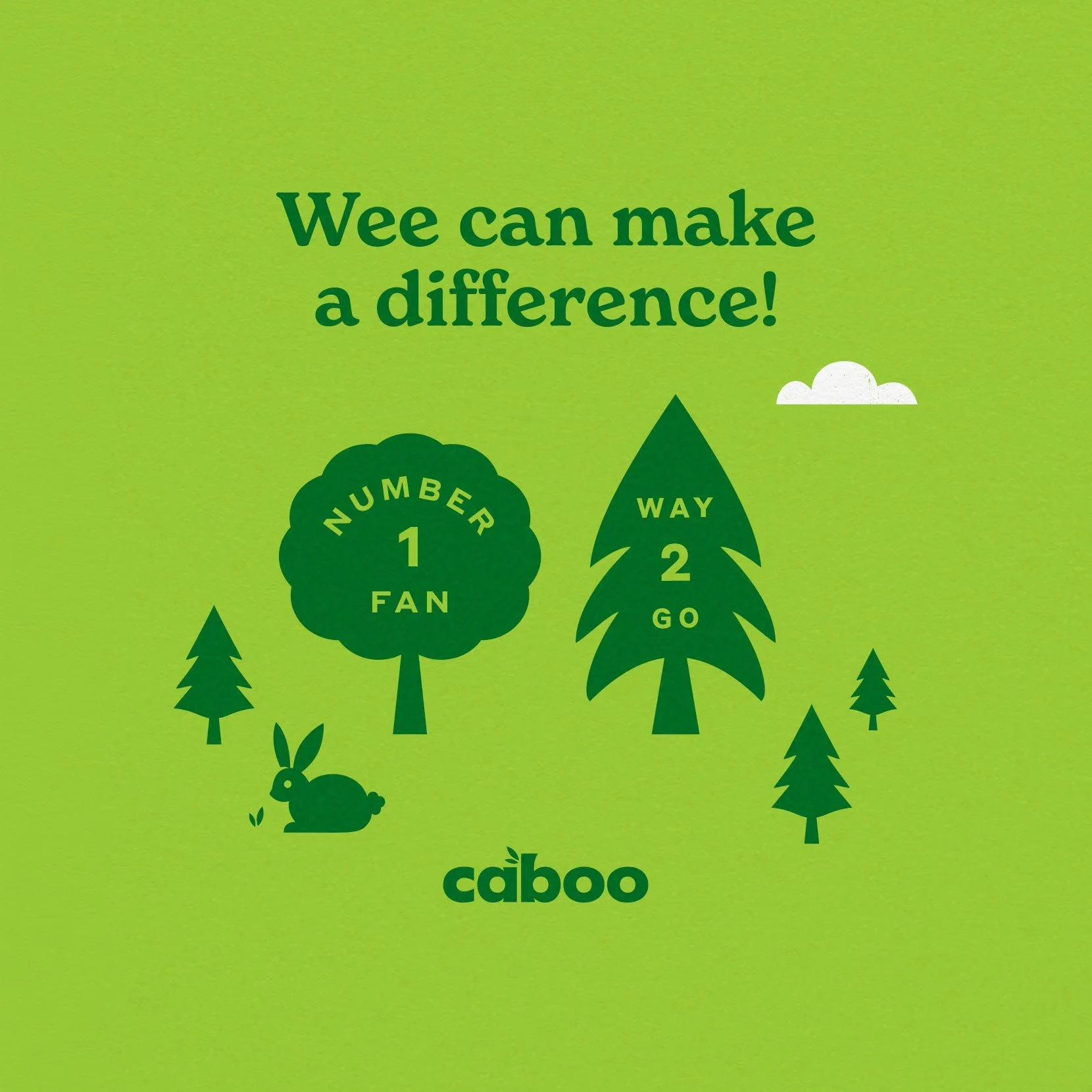
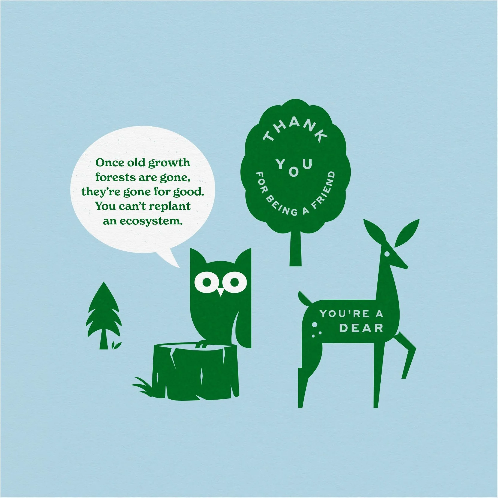
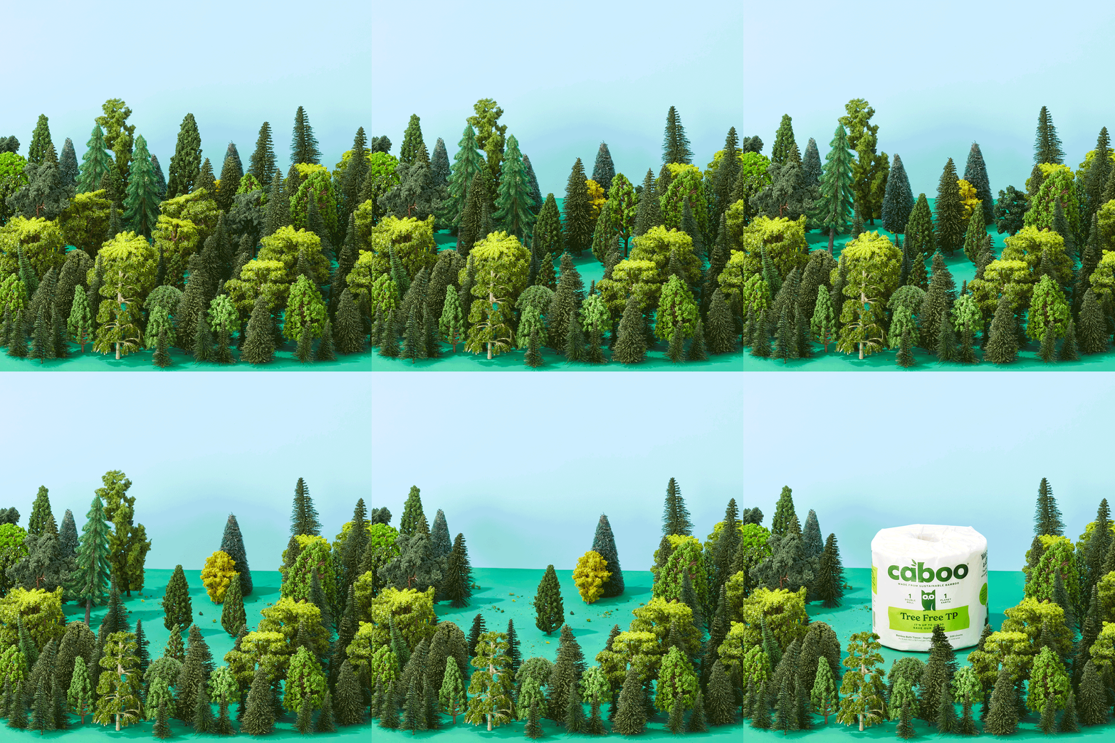
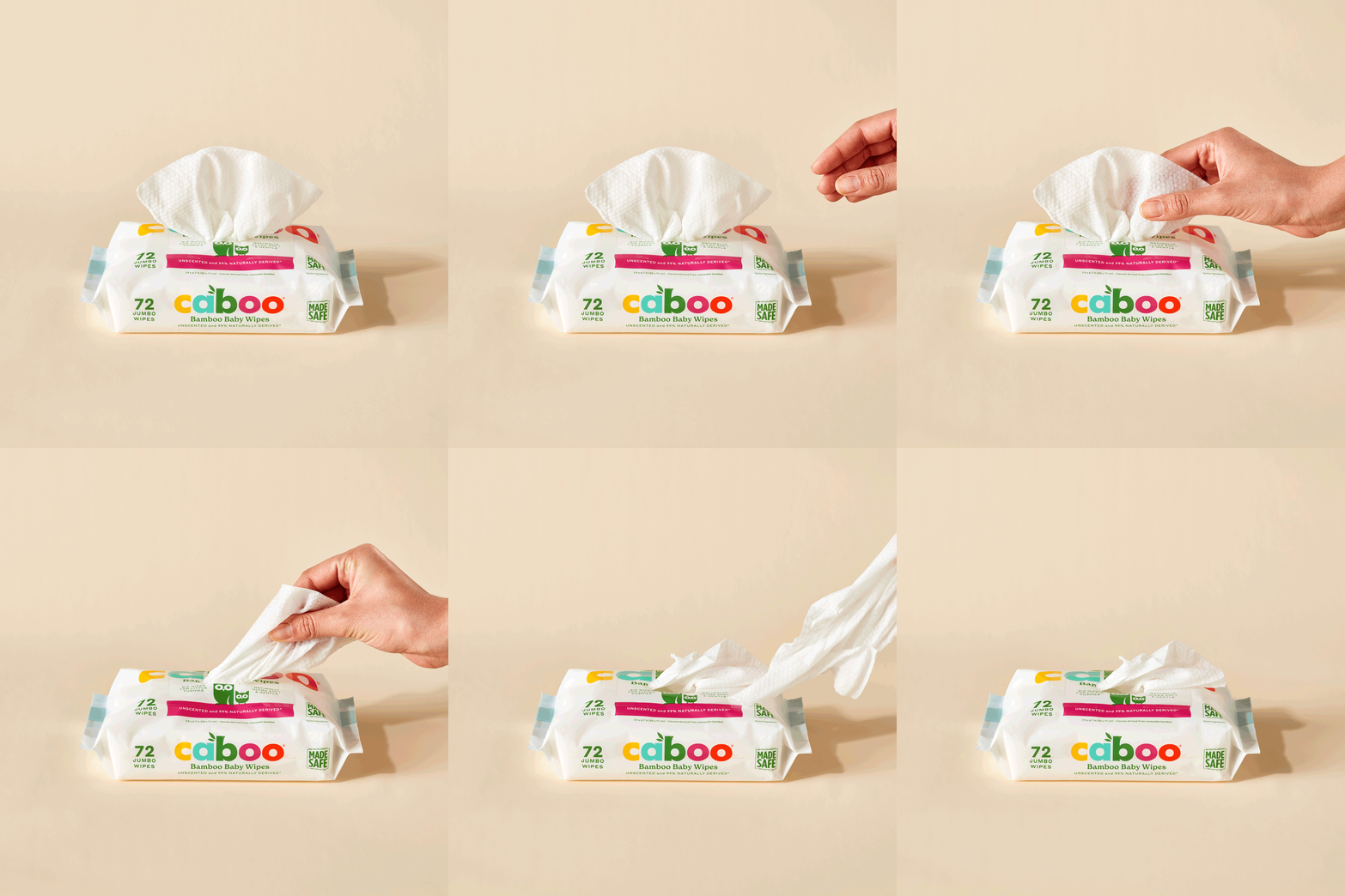
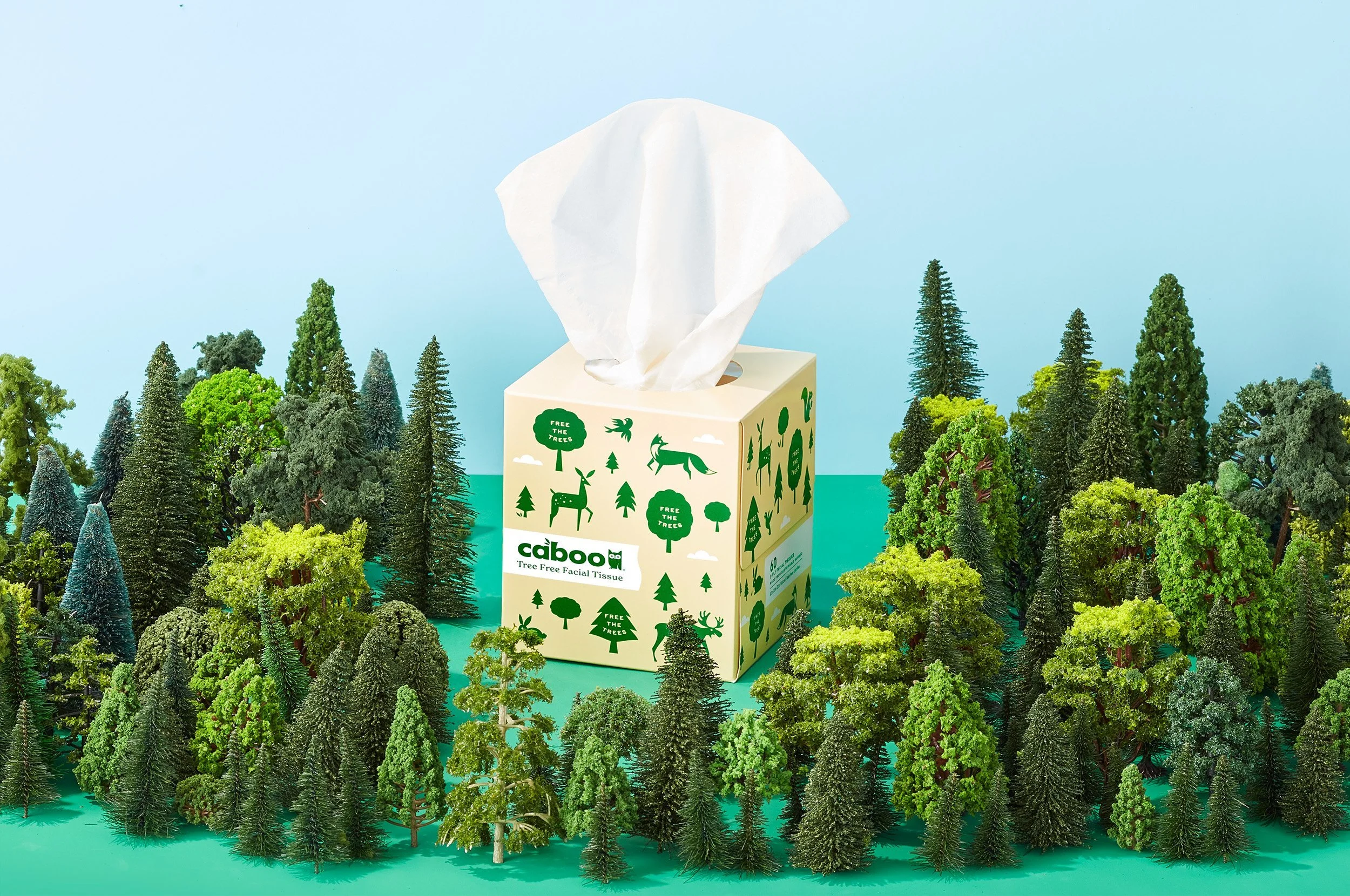
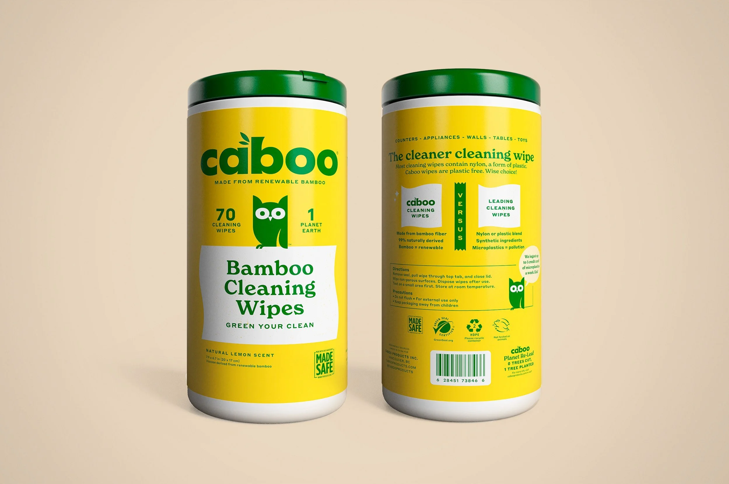
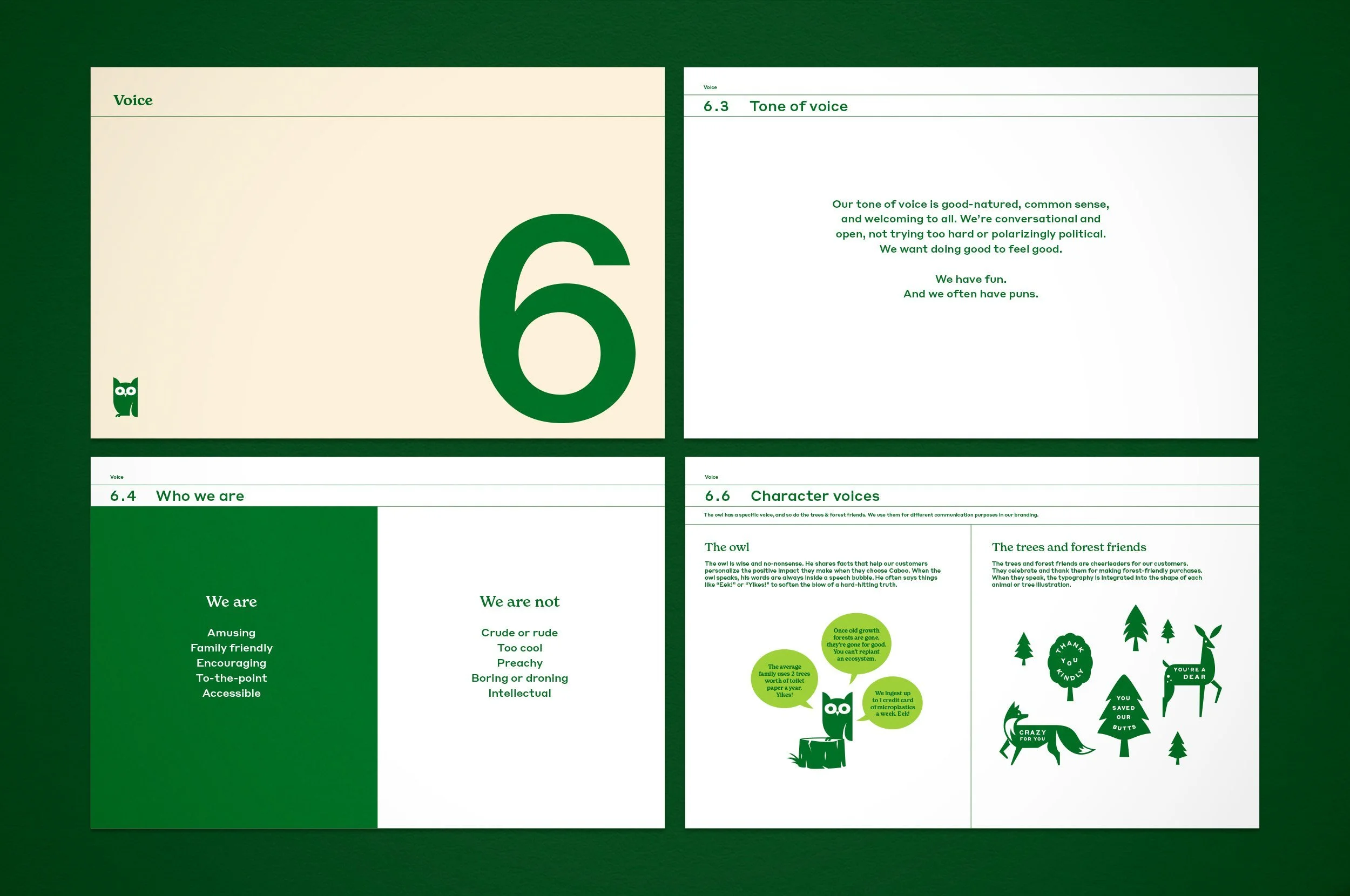
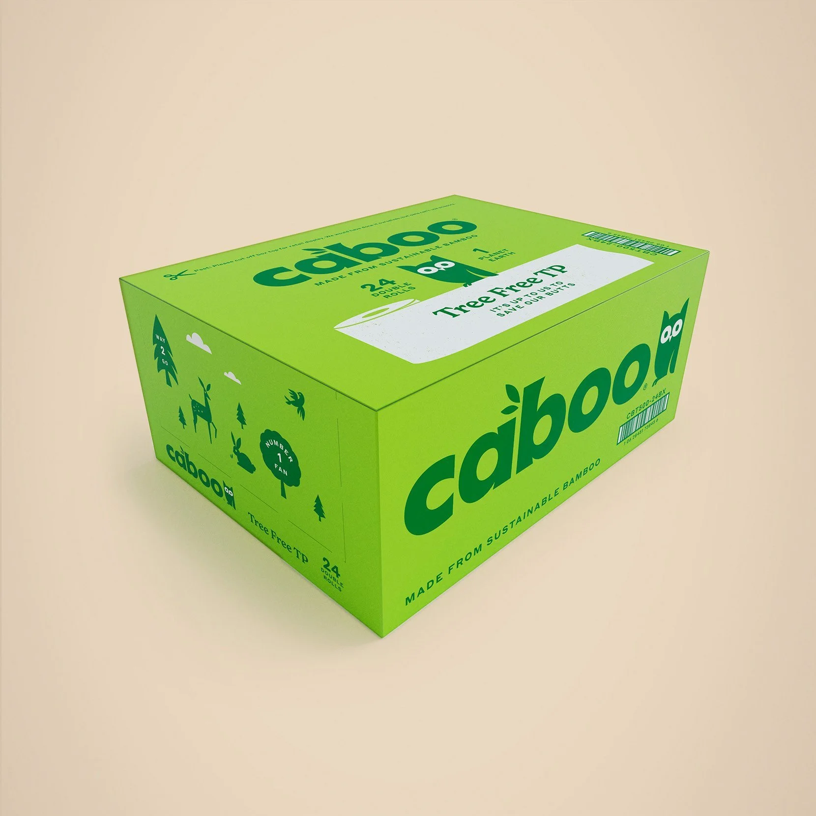
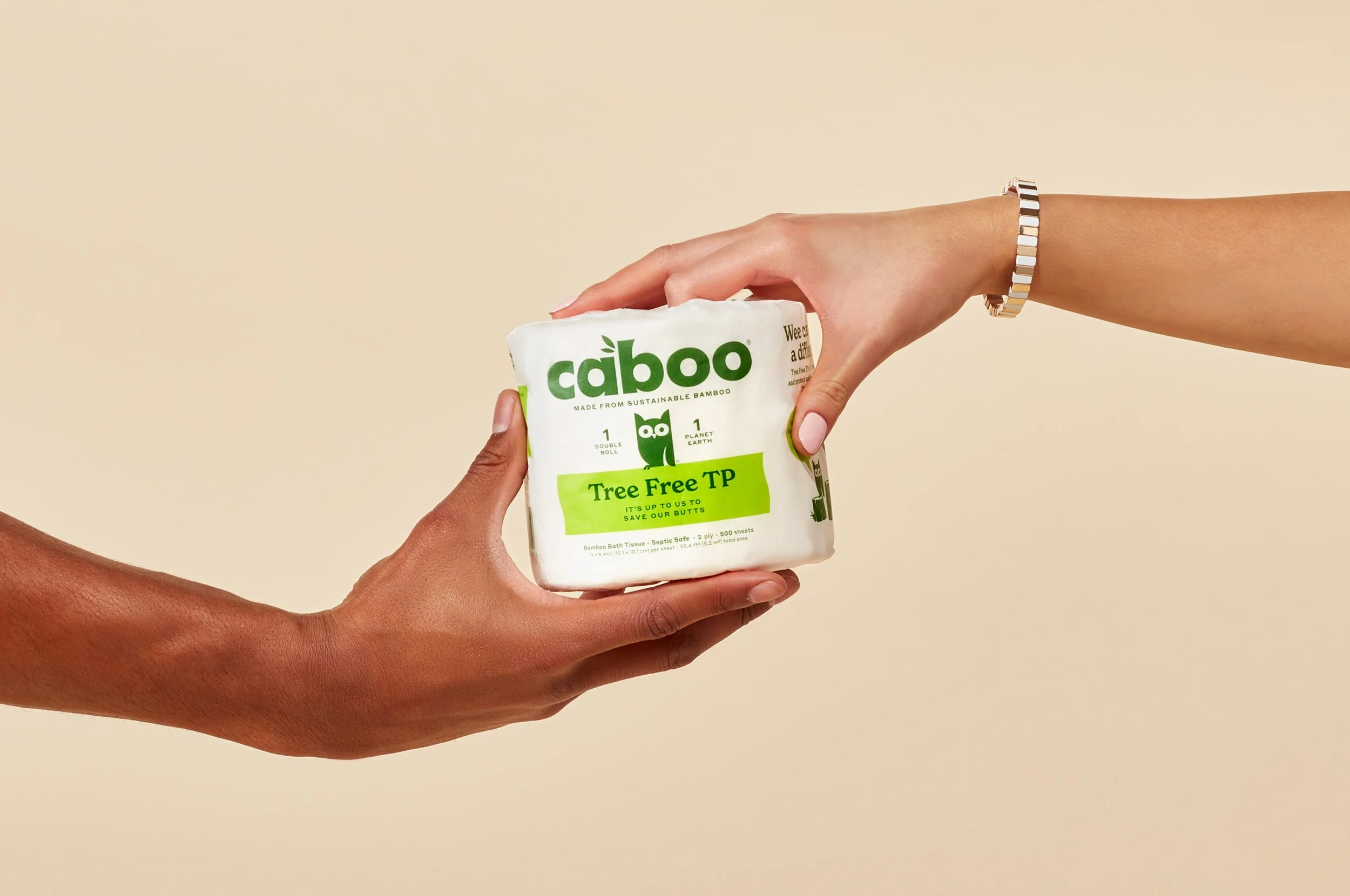
Carbon is confusing. Bamboo is foreign. We ditched the default category script to focus on what people really care about: saving the forest. We developed a bold new visual and verbal language built around sweet forest creatures, grateful trees, a wise owl mascot, and an optimistic outlook on consumer choice: “It’s up to us to save our butts!”
-
Brand strategy: positioning, narrative, voice, point-of-view
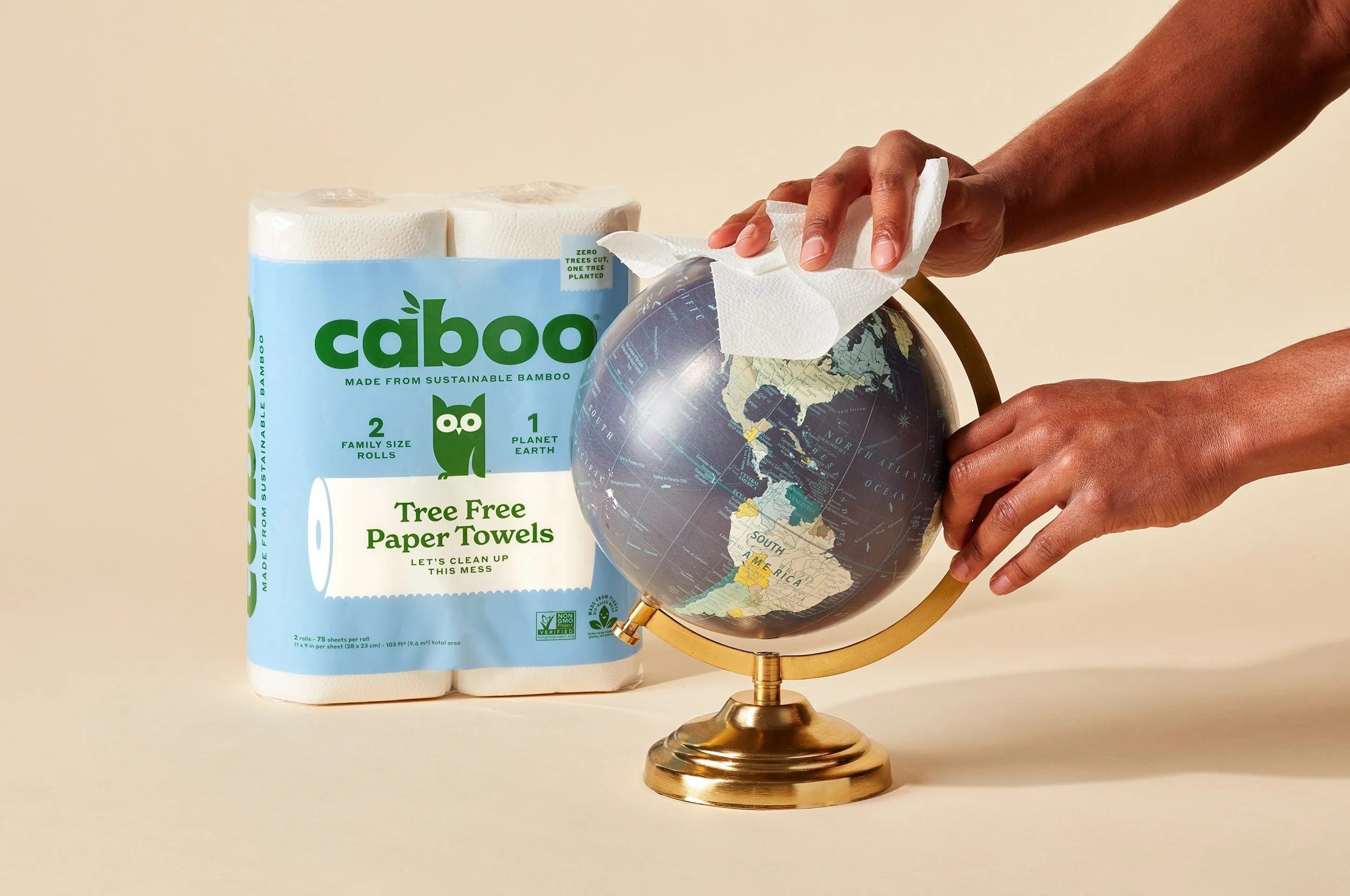
Brand and packaging design
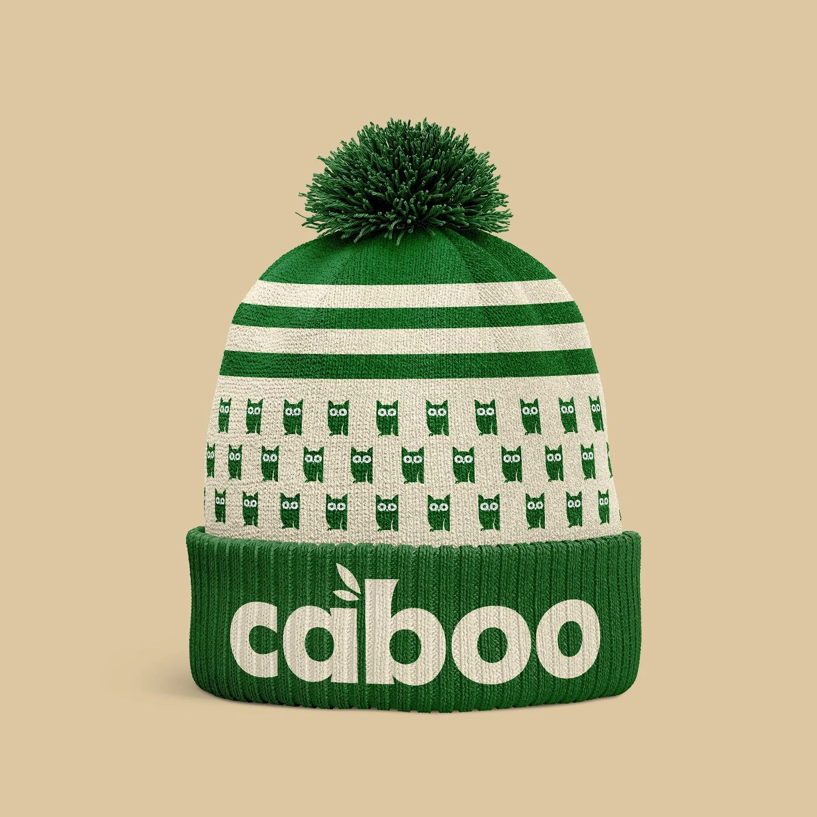
Visual and verbal brand language and toolkit
Photo art direction
Social and marketing content pillars and messaging guidance
-
Caboo is now the #1 tree-free brand in the US, they’re #1 in all every one of their categories on Amazon, and their distribution is rapidly expanding across North America.

Before
Caboo’s original packaging was bamboo-centric and unemotional. It was getting lost on store shelves and overshadowed by newer, more design-forward competitors.


